Best museum displays: it’s time to go back to our roots
A virtual journey through museum displays that have marked European art history. Enforced closure may soon offer an opportunity to spark a debate.
The enforced closure, among other things, of historical museums is an opportunity to re-think their displays, with empty rooms and plenty of time. For example, what happens when the museum display is designed by a creative architect? In the best cases it happens that the works move from the walls to the centre of the rooms; that the interplay between the works improves; that the collections become more homogeneous and scenic; that even very heterogeneous environments become harmonious; that the public navigates the museum in many directions instead of following a single ideal line; that the museum strengthens its identity.
The following selection includes some of what we believe are the best displays of fine arts museums in Europe and beyond; namely those that is worth reflecting on, perhaps to get some ideas. Some might note that the perimeter we are trying to trace does not include highly innovative museums such as the Musée du Quai Branly in Paris by Jean Nouvel, the Musée des Confluences in Lyon by Herzog & De Meuron, the Museum of Islamic Art in Doha by I. M. Pei and Jean Michel Wilmotte, or the Louvre in Abu Dhabi by Jean Nouvel. But even though it comes from long ago, the art that these museums preserve does not have such a deep-rooted exhibiting tradition as the art ranging from classicism to the Enlightenment – a kind of art that is generally designed to respond to specific architectural purposes. And this is a further reason to re-discuss the nature of the museum space itself, perhaps bearing in mind that most of the museum displays that follow have been an expression of the need to reconstruct something that WWII had temporarily deprived us of.
You may also notice that most of the museum displays on our list were designed by Italian architects for Italian museums. This is an indicator of how much Italy had invested in its cultural heritage in certain periods, and how much those investments, unlike others, still bear fruit.
The museum displays of Palazzo Bianco, Palazzo Rosso and Sant’Agostino, by Franco Albini
Franco Albini adopts for the first time the idea of creating an exhibition route featuring works floating in space on the occasion of the retrospective exhibition about Gino Bonichi, known as Scipione, held at the Pinacoteca di Brera in 1941. Albini designs a grid of steel cables that runs above the viewer’s head and installs uprights anchored to the floor. These are the same uprights that would later characterise, for example, the iconic bookcase designed by Albini for Cassina in 1956 and which, between the two wars, the architect had tested, for instance, in the temporary installations designed for the VI Triennale di Milano. When it comes to museum installations, Albini tends to bring the two-dimensional world of painting into the architectural space, thus transforming the paintings into vibrant sculptural objects.
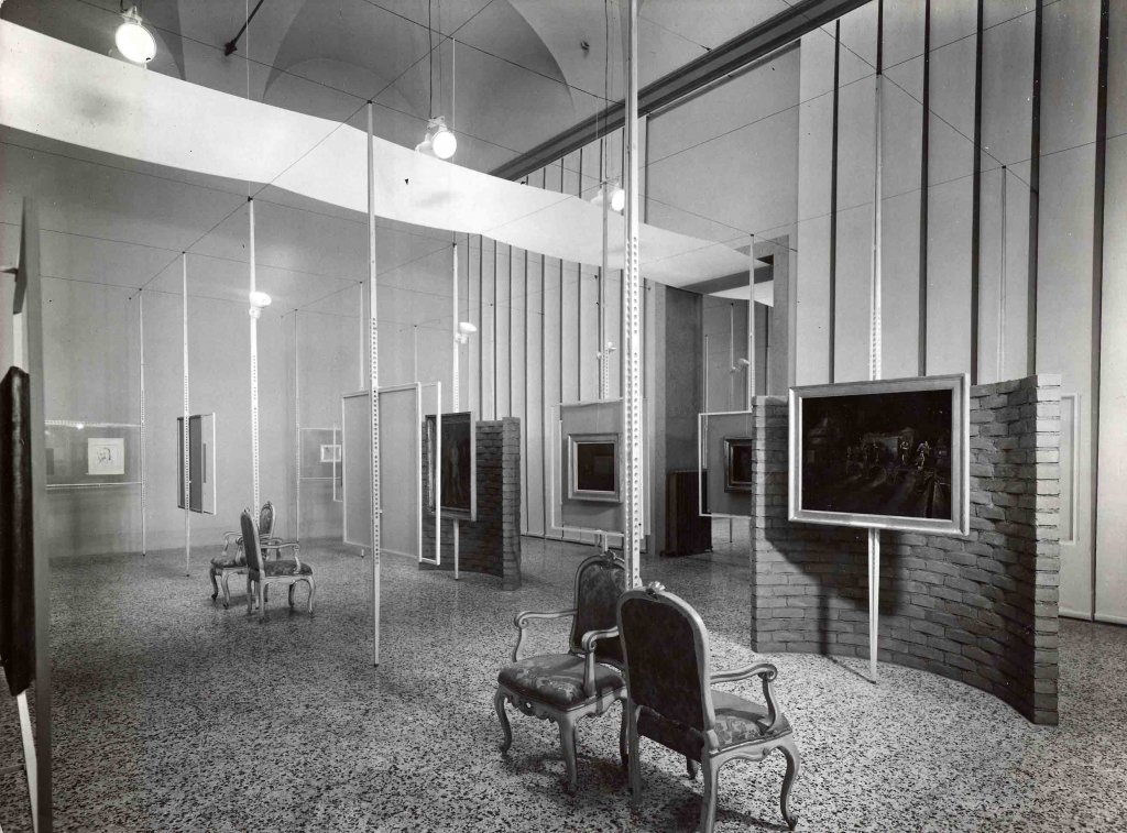
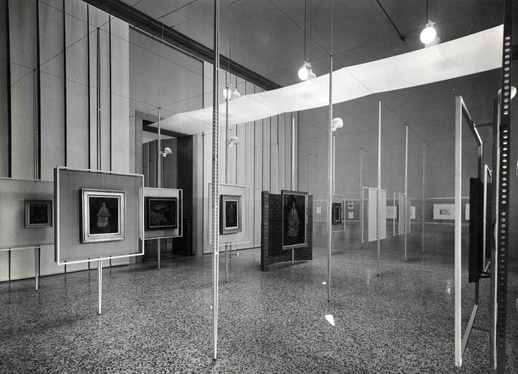
A few years later, in Genoa, Albini has the opportunity to try his hand at two important permanent museum installations, those of Palazzo Bianco and Palazzo Rosso, the two main museums of Strada Nuova. Both museum displays are partially existing today. At Palazzo Bianco the architect works from 1949 to 1951, assisted by Caterina Marcenaro, art historian and director of the Fine Arts Office of the city of Genoa at the time. The design endeavour is important. Every sculpture, every stone material, every painting, has a custom-designed support – and this means removing the paintings from their traditional frames. Albini uses brown metal, exposed screws, steel cables, creating a sort of connective tissue between the artworks which confers a strong unity to the collection.
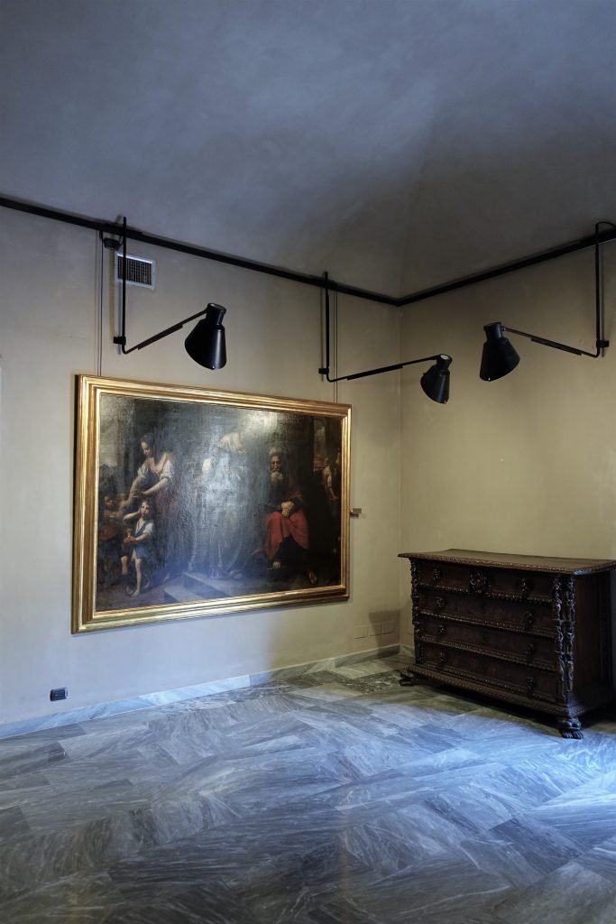
In 1952 Albini also redesigns the museum display of Palazzo Rosso. Works will continue until 1961. Franca Helg also takes part in the project. The renovation is also important, but visually a little less invasive than the of of Palazzo Bianco. Thin metal arms sprout from the walls to bring the lamps in front of the paintings, but they remain largely leaning against the walls. Here Albini introduces some metal frames that – rotating on one side – allow the visitor to see the back of the painting.
The purified elegance and rationalism of the architects of that time caused new and specific connotations in the old museums: rarefaction of the works on display; neutralisation of the walls; false ceilings and panels hiding the ancient decorations; intense and radiant lighting. In some cases even the frames were eliminated.
A. Mottola Molfino, Il libro dei musei, 1991.
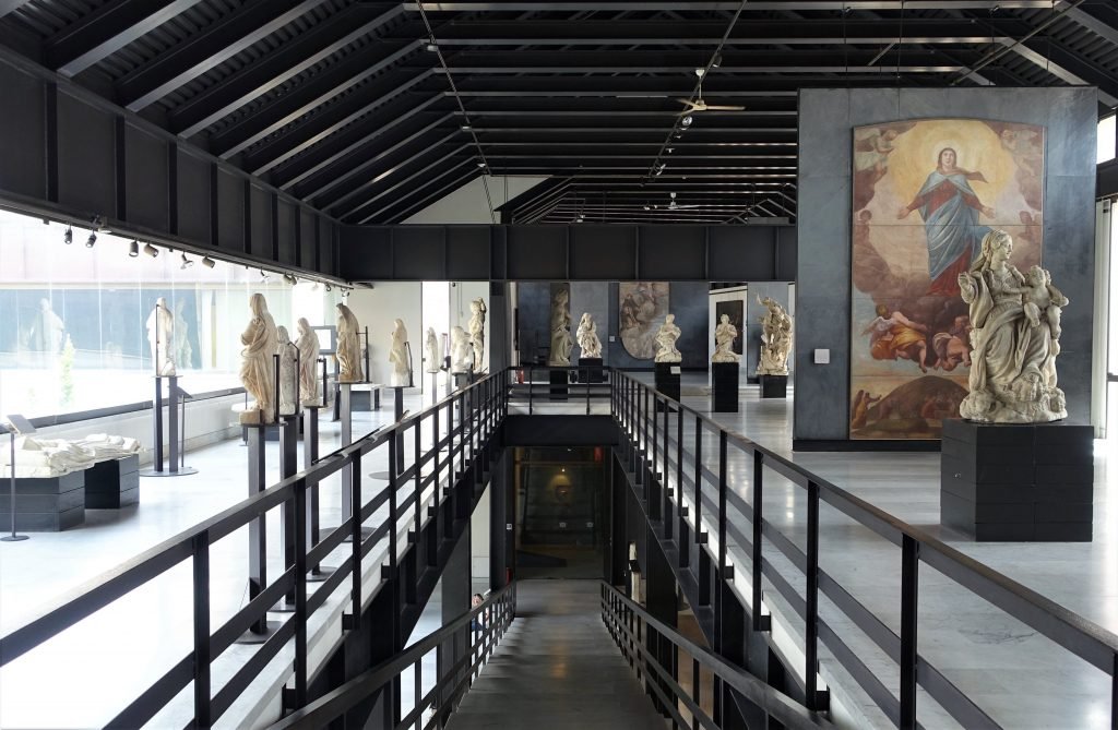
In Genoa, between 1963 and 1979, Franco Albini (with Franca Helg and Antonio Piva) also designs the renovation and museum layout of the complex of Sant’Agostino degli Eremitani, which mainly gathers sculptures. The approach is similar to that chosen for Palazzo Bianco, but the intervention is perhaps more radical, as the building partially collapsed during the war. During the renovation there are many hurdles to overcome and the project was completed only in 1986, after Albini’s death. Also in this case metal frames, pedestals and platforms are produced ad hoc. The setting rewards the unity of the collection, even if it departs rather decisively from the original style of the building, which dates back to the 13th century.
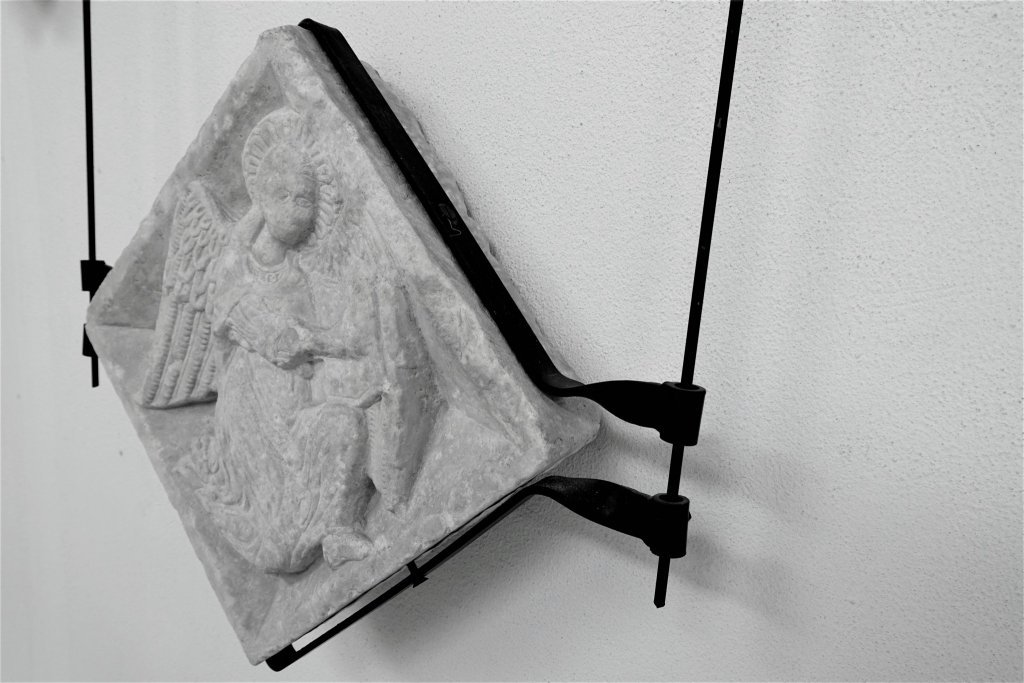
Palazzo Abatellis, by Carlo Scarpa
In 1953 Carlo Scarpa is asked to design the Regional Gallery of Sicily, located in Palazzo Abatellis, in Palermo. The building destined to house it is a noble residence dating back to the end of the fifteenth century, and it had been damaged by bombing. The restoration is intended to create a close relationship between the architecture and the works of art that were going to be preserved there.
Carla Scarpa designs the project in 1953. On June 23rd of the following year the restoration work is already finished. Scarpa is in charge of the architectural works and the museum display. With the support of the local superintendence, the architect also takes care of the choice of the works to be included in the gallery and redesigns the exhibition route. He abolishes the crowd of paintings and sculptures that characterises traditional museums, and makes a ruthless selection of works in order to lighten the route. At the same time, it enriches the itinerary with sophisticated scenographic solutions.
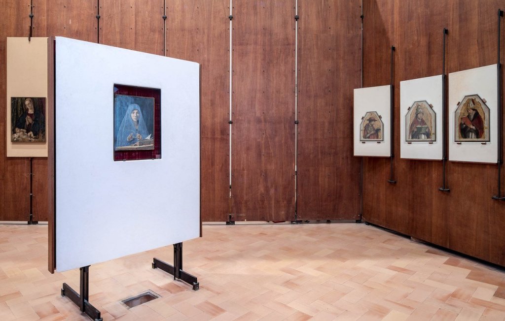

Walking through the rooms of Palazzo Abatellis becomes an experience of discovery. One has the feeling of following a precise narration. The perception is that of moving in a continuous space, where the openings on the rooms become immaterial elements that articulate the path. Each work of art offers itself to different points of view. The game of the doors that bring to the exhibition spaces creates astonishing correspondences. Sometimes, if you look from a distance, the sculptures in one room seem to overlap with the works in the following rooms, thus whetting the visitor’s curiosity to discover the next masterpiece.
The large painted wooden crosses are not placed against the walls, but occupy the living space. They invite you to grasp their physical presence, to go around them, to insist on details that do not only concern painting. Among the most evocative works in the collection are those by Antonello da Messina, gathered in a single room around the Annunziata, that is placed in the centre of the space inside a special pedestal structure rotated towards the entrance to immediately welcome the eyes of those who enter.
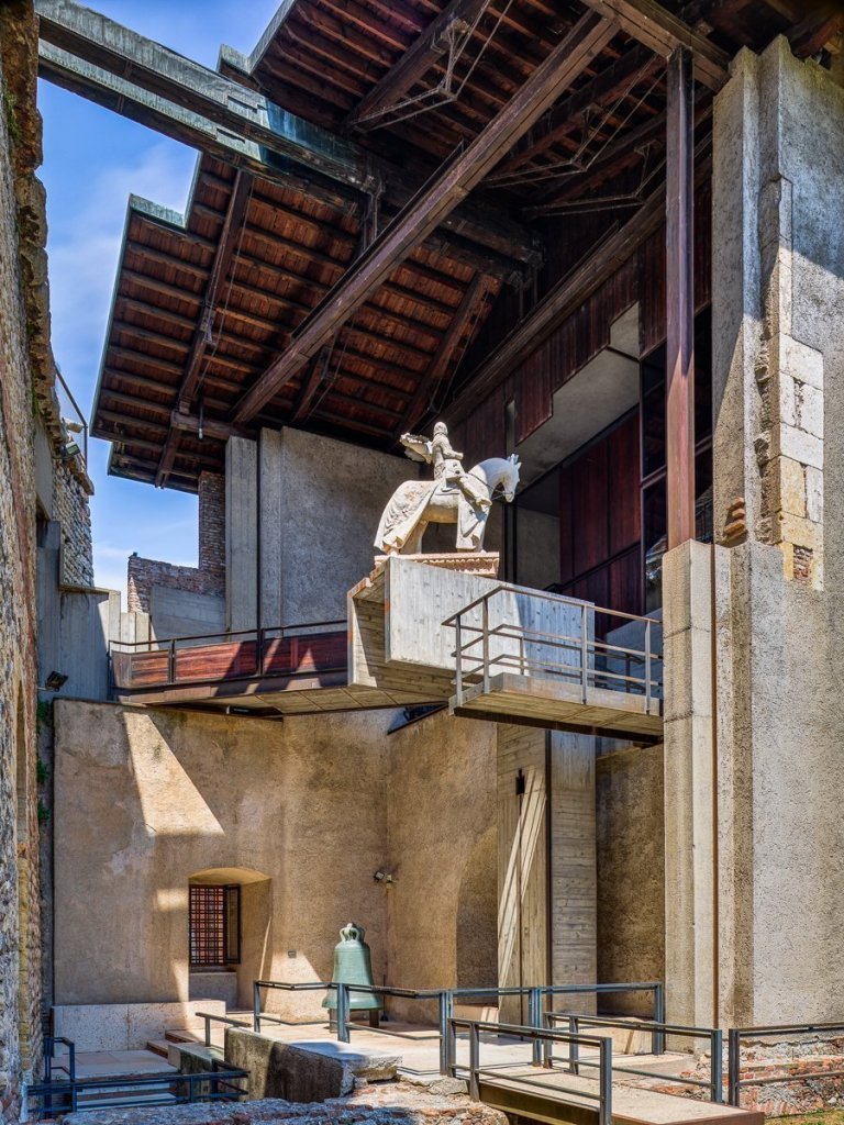
In some way, language is a pre-text for Scarpa, as pre-texts are the monuments on which he has the opportunity to intervene with his undisputed competence as a restorer or exhibition designer. In the arrangement of Palazzo Abatellis in Palermo, in the Gipsoteca of Possagno, in the restoration of the Museum of Castelvecchio in Verona, Scarpa intertwines with history a private conversation full of metaphors: the surreal placement of the equestrian statue of Cangrande della Scala is typical of this amused and thoughtful relationship with the ancient.
M. Tafuri, Storia dell’architettura italiana, 1986.
Museum of Castelvecchio, by Carlo Scarpa
Carlo Scarpa works at the Museum of Castelvecchio between 1957 and 1975, called by the new director of the museums and galleries of Verona Licisco Magagnato. The innovative approach adopted by the architect is already evident at the end of the first stage of the restoration, when the temporary exhibition entitled ‘From Altichiero to Pisanello’ is set up. It is 1958. Among the images that document the exhibition is one that shows two Madonnas with Child by Michele Giambono not hanging on the walls, but suspended from rotating iron rods. A pin hooked to the floor allows the artworks to turn on themselves showing their back.
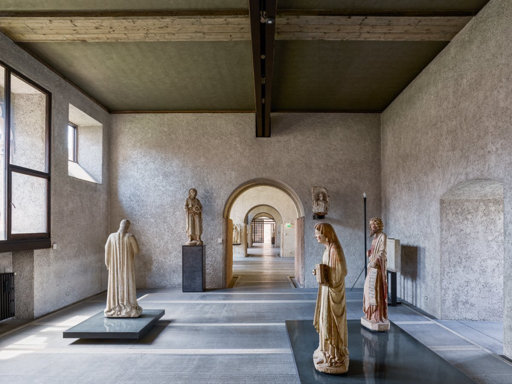
In the museum layout Scarpa treats the different tuff figures as if they were real people, perhaps imitating the chapels of the Italian Sacri Monti. True to his own style, thus ‘manipulating’ every single fragment at his disposal (Tafuri, 1986), the architect adopts a theatrical approach, which is evident, for instance, in the sculptural group of the Crocifisso e dolenti (o L’urlo di pietra). Like in Palermo, visitors find themselves immersed in a continuous space, in fact more surreal than minimalist, marked by openings to the outside that announce the final surprise, the equestrian monument to Cangrande della Scala, midpoint of the visit rather than apex.
Much has been said about the Museum of Castelvecchio in Verona when the 17 paintings stolen from its rooms in 2016 were found. Among them were works by Pisanello, Jacopo Bellini, Giovanni Caroto, Andrea Mantegna, Jacopo Tintoretto, Peter Paul Rubens. The paintings had been buried underground on a Ukrainian island.
Here is the link to the article that CFA had dedicated to the case.
Castello Sforzesco, by BPR
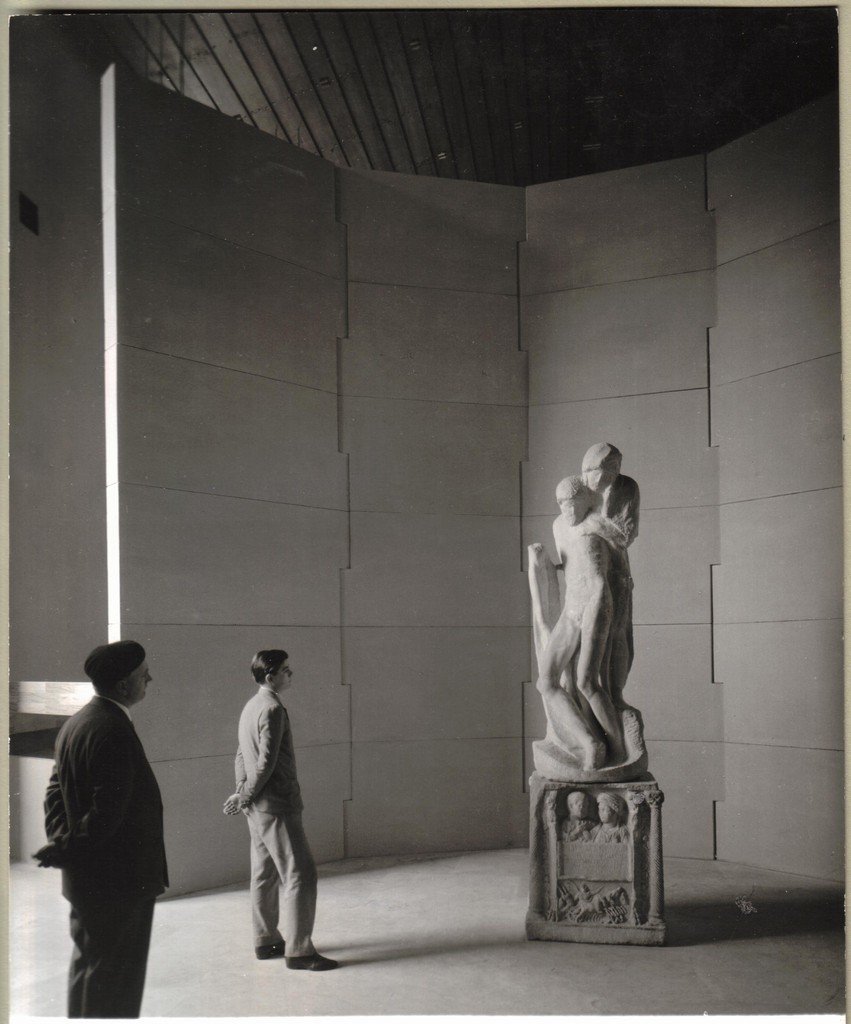
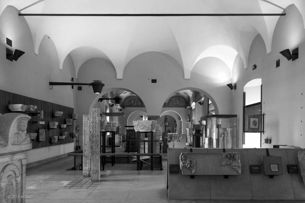
As we have seen, in the post-war period, the anxiety of art historians of the nineteenth and early twentieth century gave way to a new concept of art experience. This also happens in the case of the Castello Sforzesco in Milan. The refurbishment of the Castle Museum is entrusted in 1954 to the BPR studio, whose approach is consistent with those adopted in the same years by Albini and Scarpa. Here too, the museum display becomes a scenography. The exhibition machine embraces the works, unifying them and thus mitigating the strong inhomogeneity of the rooms. The interventions concern above all the ground floor (where mainly sculptural materials are placed) and the first floor, which had suffered severe damage during the 1943 bombing. Some debates arise whether the intervention was too ‘brutal’ and disrespectful of the nature of the artworks. Michelangelo’s Pietà Rondanini is surrounded by a stone wall that isolates it from the rest of the museum, and a staircase is built to access it. Thus BPR aim at underlining the extraordinary nature of the work, making it the most important piece in the museum (the sculpture was relocated in 2015). As in the case of Palazzo Bianco, BPR also prefers an overall vision, sacrificing, in effect, the individuality of the single pieces. In both cases, it benefits the identity of the museum, which is also defined by the uniqueness of the display besides its iconic artwork.
Museu de arte de São Paulo, by Lina Bo Bardi
A pupil of Gio Ponti, Lina Bo Bardi works more in Brazil than in the country where she was born. The architecture and the setting up of an extraordinarily innovative museum for the time, the Masp of Sao Paulo is owed to her. After the war Lina Bo Bardi moves to Brazil with her husband Pietro Maria Bardi, journalist, art critic, gallery owner and director of Masp for 45 years, until her death in 1999.
The museum’s exceptional collection, by far the most complete and heterogeneous on the continent, ranges from Bernardo Daddi to Tintoretto; from Hieronymus Bosch to Gustave Courbet; from Gauguin to Picasso and Warhol. Lina Bo Bardi imagines a museum display where the visitors and the works blend together within a single huge parallelepiped of concrete and glass, suspended thanks to a system of tie rods and huge steel beams. The project and construction of the museum lasts 12 years, from 1957 to 1969.
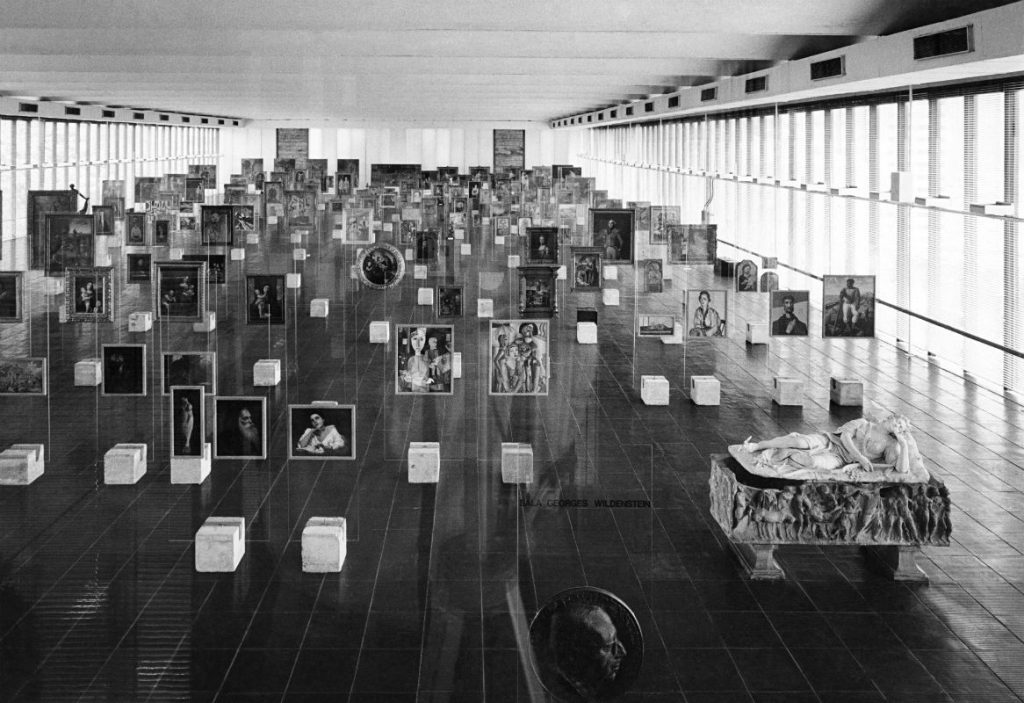

Mounted on crystal slabs or in transparent showcases, the paintings rest on rough concrete blocks. The museum display is conceived as a continuum, that is without a beginning and an end. The installation encourages the viewer to embark on a journey outside time: the only protagonist is, rather, the space. Each work is contemporary to the viewer.
The equipment is removed in the 90’s. But since 2015 it has been back to making the Masp’s rooms unique thanks to the will of its new director, Adriano Pedrosa, who is in favour of giving up a linear narration of art in exchange for a greater empathic involvement of visitors.
As you enter the room you encounter the oldest piece, and it goes like a sine wave, a serpentine, and then you have the very last piece here, which is the only 21st century artwork on display. It is a work by Marcelo Cidade about the fate and the past of the whole picture gallery itself. As a matter of fact Lina writes in her papers about the possibility of chance encounters between works; so they wouldn’t follow a traditional narrative, or a traditional art historical chronology.
A. Pedrosa, interview with Maria do Carmo M. P. de Pontes for CFA.
Museum display of the Castello estense in Ferrara, by Gae Aulenti
Even a place without an art collection can become an opportunity to visually narrate a historical-artistic journey. This happens with the display that architect Gae Aulenti designed for the Castello Estense in Ferrara. The imposing building, surrounded by a deep moat, was built in 1385 and then became an Este residence.
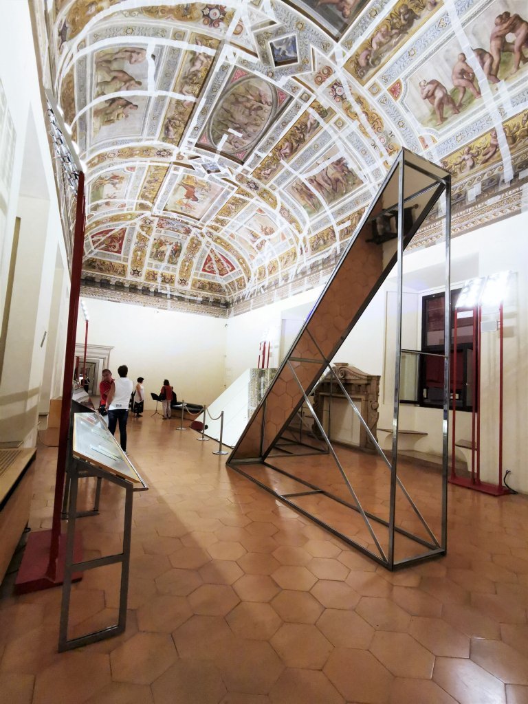
The museum display by Gae Aulenti opened to the public in 2004. It is an itinerary that makes 42 rooms accessible to the public – including the cramped prisons – to tell the story of the castle itself and that of the Este’s power, the most important family in Italy during the Renaissance. The most significant feature of the exhibition – which is very discreet if compared, for instance, to what Aulenti did at the Musée d’Orsay – is the large mirrors placed in the most decorated rooms to lower the ceiling frescoes down to the level of the viewer’s gaze.The mirrors are supported by sculptural structures, which in fact become stage machines, occupying a space that would otherwise remain empty (as mentioned, the castle does not have an art collection).
The Italian museum tradition, although unrivaled, will end up representing a cultural obstacle to the idea of creating new museums in new buildings in the country, and therefore of feeding a design knowledge able to draw its sense of modernity from its relationship with space and time and not only from the comparison with the pre-existence.
P. Ciorra, in Architettura del Novecento: teorie, scuole, eventi, 2012.
Museum display: Louvre Lens, by SANAA
The Louvre Lens was inaugurated in 2012, but the project of the museum dates back to 2003 and it is conceived by the Japanese architectural firm SANAA – who, among other things, have also signed the New Museum in New York and are currently working on an extension of the Art Gallery of New South Wales in Sydney. The most iconic space of the museum is undoubtedly the so called Galerie du Temps. Here the layout of the works is anarchic and Cartesian at the same time. There is no division by region or technique, but rather a chronological order that starts from 3500 BC to 1850. Also in this case the visitor is free to move among the works; but the exhibition concept is exactly the opposite to the one conceived by Lina Bo Bardi for the Masp. In Sao Paulo, time was abolished in favour of space. In Lens, time defines the layout of the great hall instead. Chronological references are engraved on the walls. So even the less experienced visitors need only a brief glance to understand where in history they are standing. Everything links up in a sort of enormous hypertext. The result is a hybrid between the eighteenth-century Encyclopédie française and the ‘disintermediation’ of the web.
Here is a paper we dedicated to the Louvre Lens two years after its birth.

Acropolis Museum, by Bernard Tschumi
The new Acropolis Museum came into being in June 2009 and is signed by architects Bernard Tschumi and Michalis Photiadis, and archaeologist Dimitrios Pandermalis. Considering that it is a museum entirely dedicated to classic art, its structure is highly audacious. The museum is in fact a sort of transparent box designed to allow the visitor to connect the works that are kept inside the museum with the external environment, the Acropolis of Athens, from which the works of the museum largely come.
The light that illuminates the airy halls of the Acropolis Museum is mainly natural light. The transparent floor leading from the museum’s threshold to the interior allows a glimpse of an extensive excavation area – still operational today. As in the cases we have seen so far, there is a feeling that the works of art inhabit the museum, rather than simply finding a place of conservation. Unfortunately, not even the extraordinariness of this structure has managed to solve the historical problem of the Parthenon friezes, illegally stolen by England and never returned to Greece and Europe.
November 17, 2022
