
Jos Amman von Ravensburg in Chiaravalle
Jos Amman von Ravensburg: from the cloister of San Bernardo to a new transmontane presence in Milanese painting of the Sforza age.
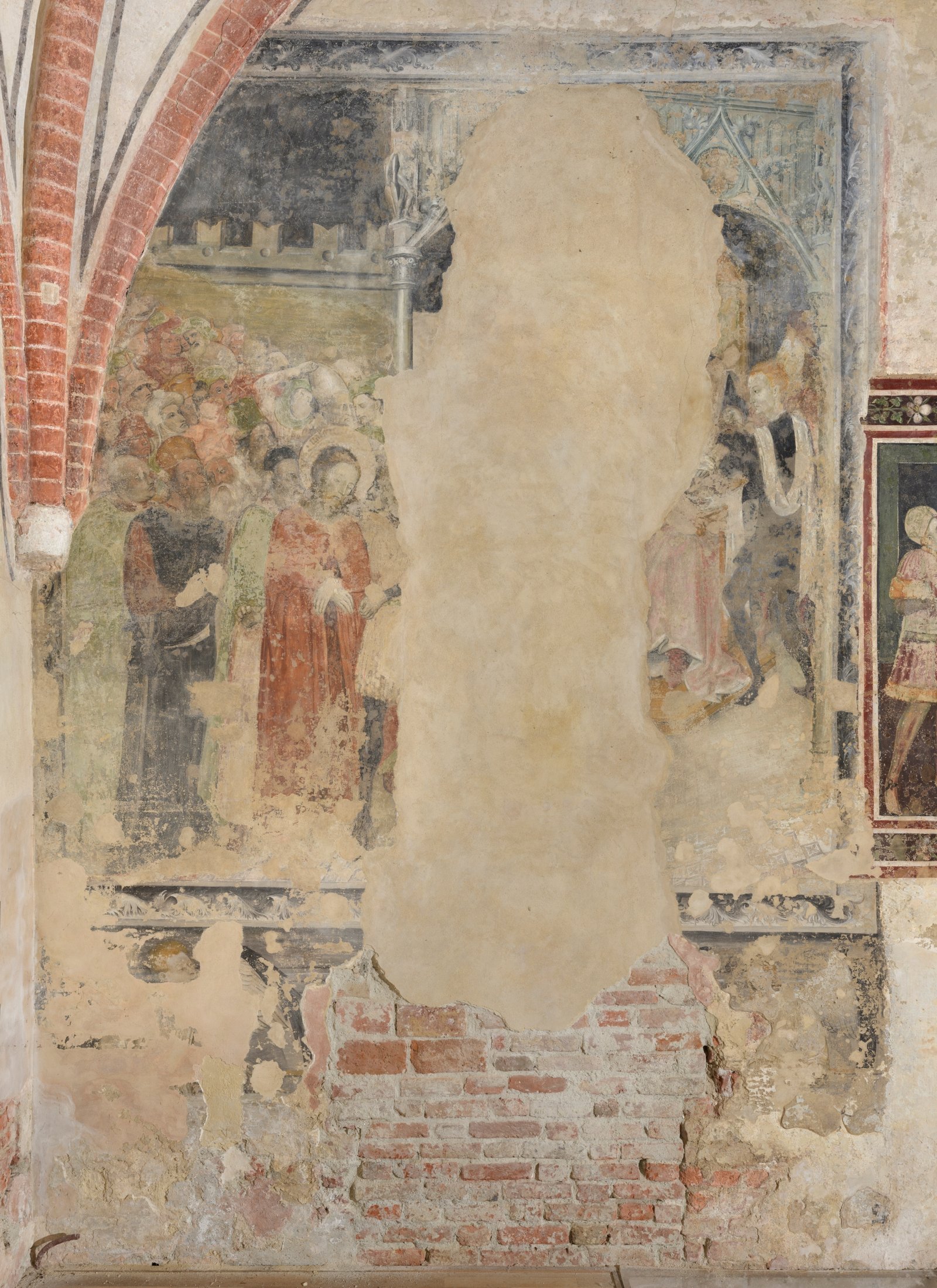
For the past ten years, a significant 15th-century fresco of Nordic culture, depicting Christ before Pilate, has been on display in the oratory of San Bernardo at the Chiaravalle Milanese abbey. However, the painting still struggles to find its rightful place. If it were not for that wall – which brings out and crystallizes the saline substances that permeate it, almost as if to take revenge for the removal of the old whitewash, some might have even denied its connection to ancient Lombard painting. Instead it is there, and one wonders what such an exotic exploit is doing in the small oratory commissioned in 1412 by Abbot Fontana for the spiritual care of a few farmers: “a chapel of St. Bernard, where women hear mass every morning, and already in the definition of ”women’s church one can sense the disparaging inflection 3. Nor will a confraternity of the Santissimo Sacramento, attested only in 1571, explain such an intrusion of taste and quality.
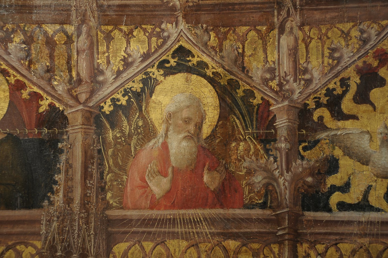
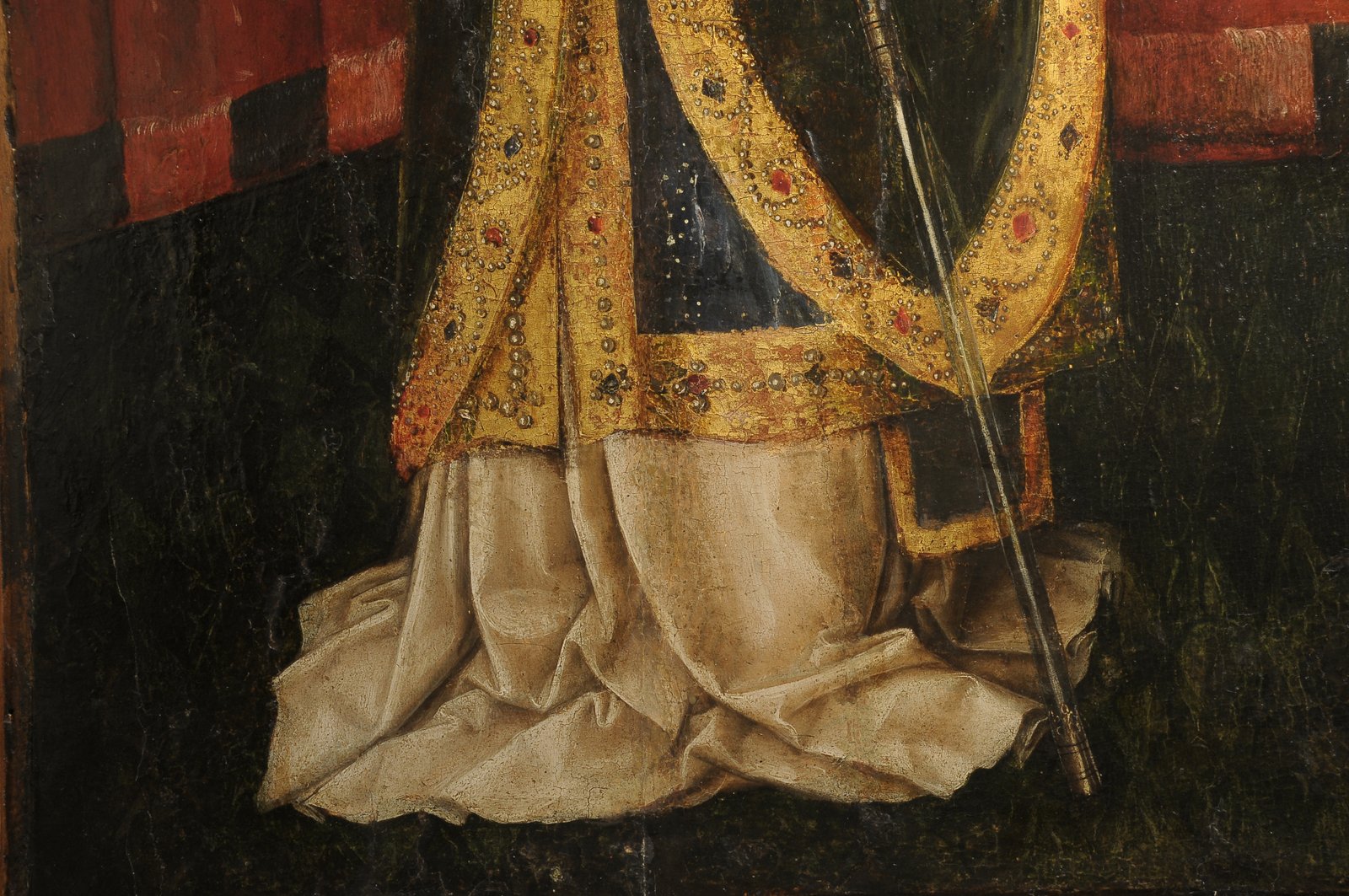
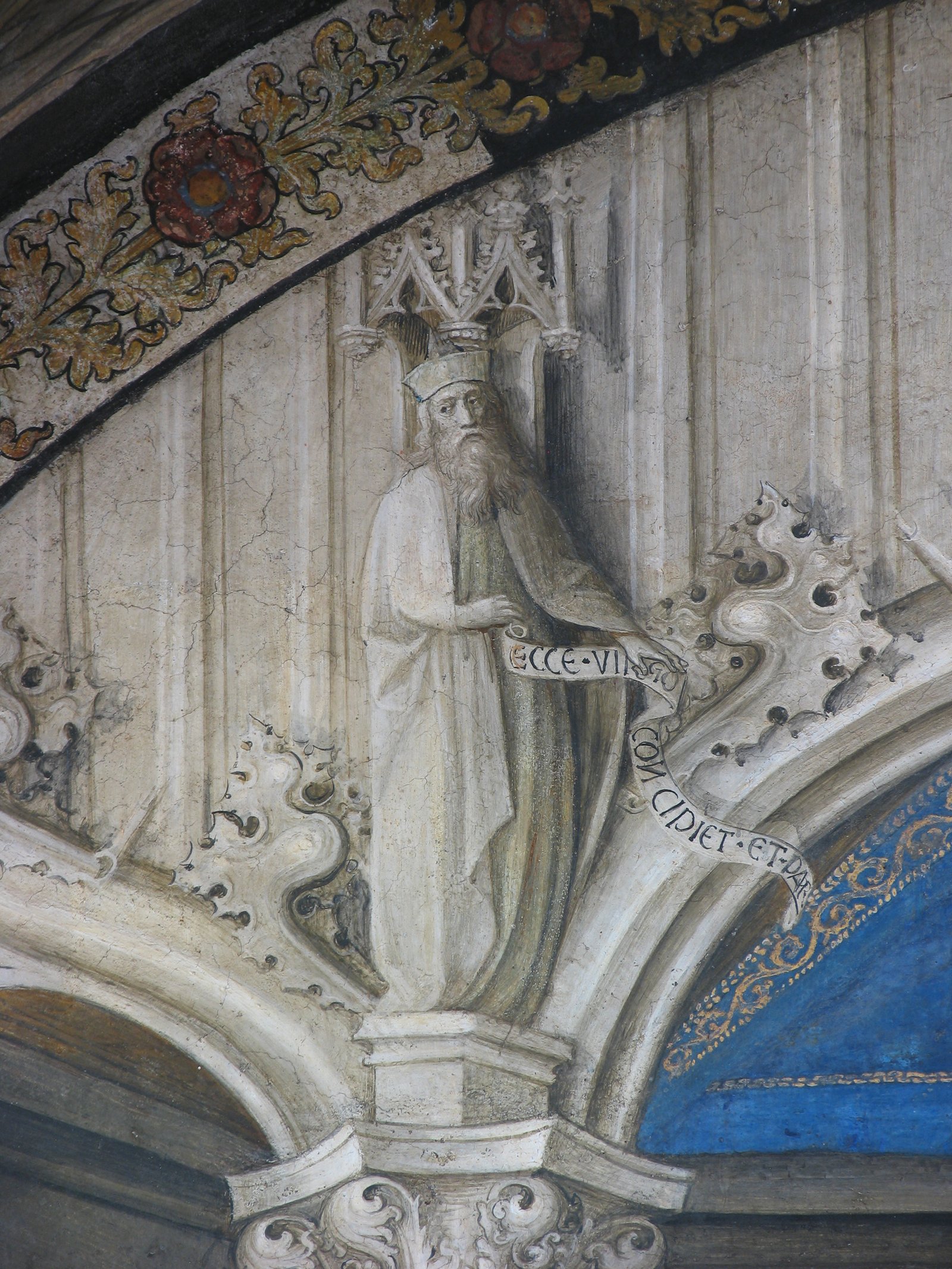
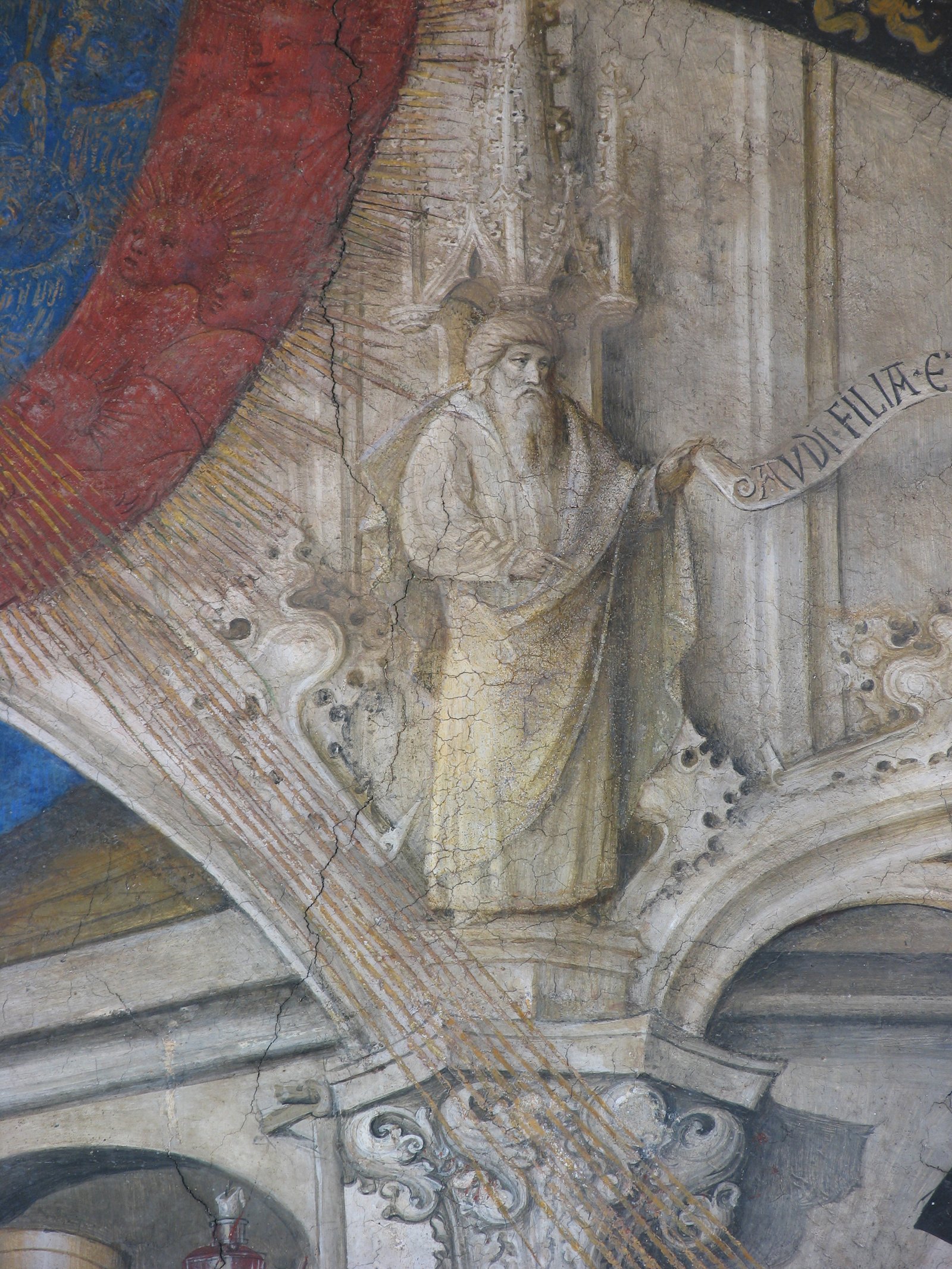
From another oratory near Milan a new painting comes to enrich this cross-border, non-Flemish affair. It is a panel that measures approximately 160 in height and 140 in width. In the center it depicts Christ showing the wound in his side, flanked by two small angels who hold the red mantle that hangs behind him. To his right stands St. Ambrose, holding a crosier and a whip, while on the left is St. Augustine, who holds both a crosier and a heart pierced by arrows. The former is adorned with a rich and heavy dark-blue mantle, featuring bronze jeweled borders and a white robe; the latter wears red robes and shoes, along with a mantle that appears to be brown, crafted in gold.The figures stand before a bare and rather deep interior, divided into three equal bays with vaults, possibly cross-shaped, and walls covered for most of their height by a red curtain hanging from a frame with seemingly metallic mesh. In the upper register, held up and framed by an elaborate faux architecture, with elegantly cusped niches and small statues (all wood-colored on a gilded background) there are small windows that house the evangelists Luke (in light red robe), John (in a brown robe), God the Father (in a red mantle, surrounded by yellow figures of angels), the Holy Spirit, and the Saints Peter (in a pink robe and green mantle) and Paul (in a brick-red robe). The curtain that serves as a backdrop for the figures is a soft blue-green hue. The nimbuses and flames radiating from the dove are golden.
By the middle of the eighteenth century, and likely for a long time before that, the panel was located in the small church of Sant’Ambrogio in Brugherio, a few miles northeast of Milan: “altare pareti adheret ornatumque sacra lignea icone, opere sculptorio vetusto, incisa ac picta, in qua inserta est tabulaq per pictura exprimens imagine Salvatoris cum imagine a dexteris Sancti Ambrosii et a sinistri Sancti Augustini”. A description from 1794 provides even more detail: “a single altar with a panel painted with good brushwork, yet ancient, is believed to date back to the 14th century.” It depicts a standing Christ with one hand supporting his wounded side, with St. Ambrose on the right, holding a pastoral miter, and staff, and St. Augustine on the left, also holding a pastoral miter and a heart pierced by arrows in his hand. The upper part features a frieze adorned with Gothic painting, divided into six boxes (…)”. This evidence does not allow us to determine with certainty whether the painting was actually created for the altar it was found on at the time, but its ancient local origin is highly probable. In terms of form and content, this 15th-century work, with its clear Nordic origin, stands out rather remarkably within the Milanese scene. The depiction explores the theme of the Schmerzensmann, presented as the ultimate Judge (the attribute of the mantle). It likely draws inspiration from an early 15th-century model by Maister Francke, with some notable variations: Christ’s left hand does not show the wound on the palm, but holds a processional cross, and the two angels holding the mantle do not bear the attributes of judgment (lily and sword).
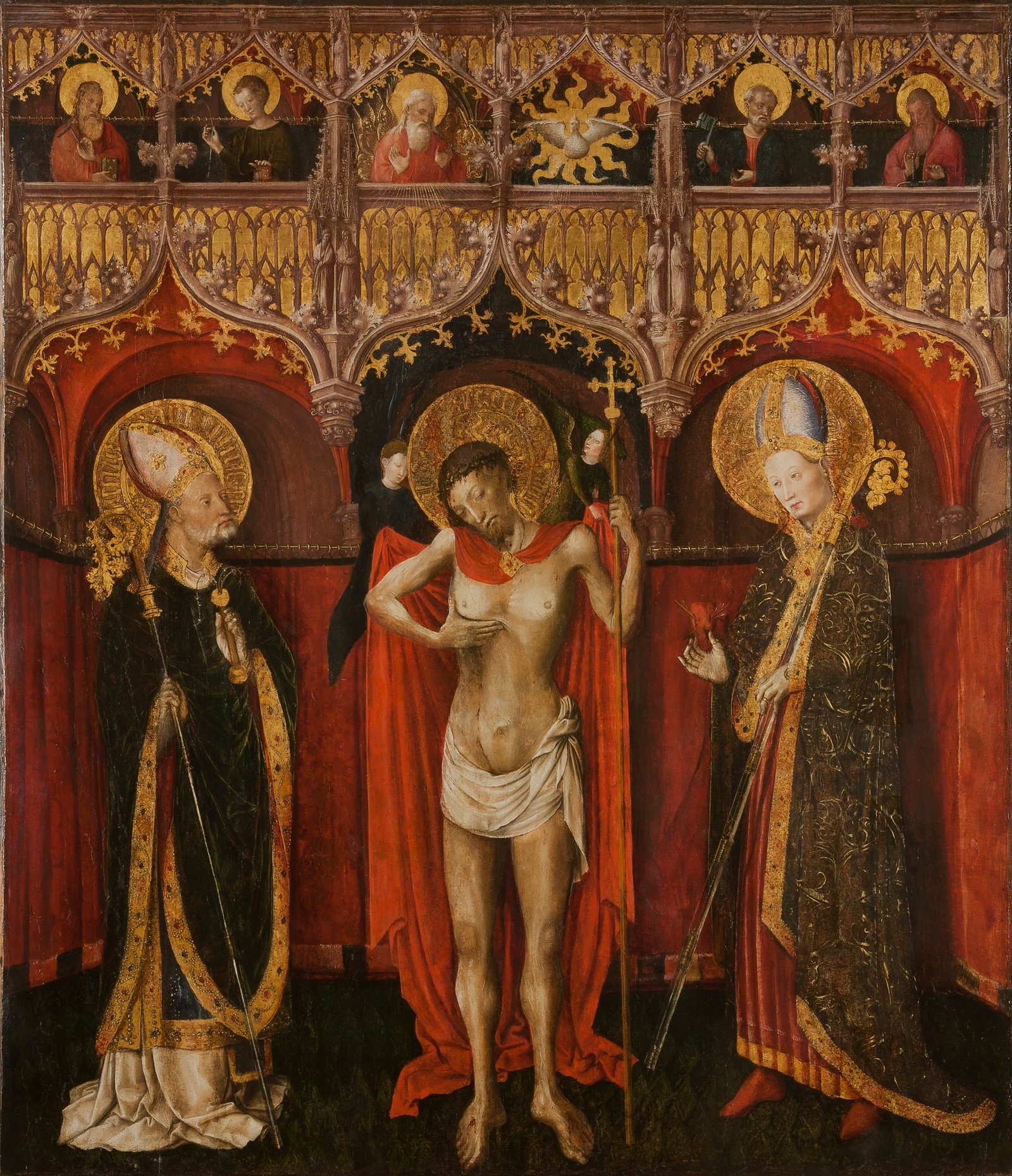
The central part of the panel expresses the Trinitarian concept, potentially referencing the interpretations of Robert Campin. Throughout Northern Italy, dominated by the Tuscan-Paduan iconography of the Christ in pity over the sarcophagus (or even, toward the end of the century, flanked by the symbols of the Passion), It does not seem to me that a similar Flemish-German model was widespread at this chronological height. Among the few examples I am aware of, it is worth mentioning the Trinity of Turin by Antoine de Lonhy, which shows some similarities despite its closer connection to the Campinian tradition, and the so-called Pietà or Our Lady of Sorrows housed in the Borgogna Museum in Vercelli. The heart pierced by arrows, held like a fragile ampoule in St. Augustine’s right hand, is also unusual. This traditional attribute (Sagittaveras tu cor meum charitate tua) is found in Italy at later dates, sometimes in the flaming variant. The inscription in the nimbus on the panel, although not easily readable, appears to confirm the identification, which is taken for granted in eighteenth-century documents. The curious appearance of St. Ambrose’s whip is also intriguing, featuring knots that distort its traditional meaning, potentially likening it to an instrument of the Passion.
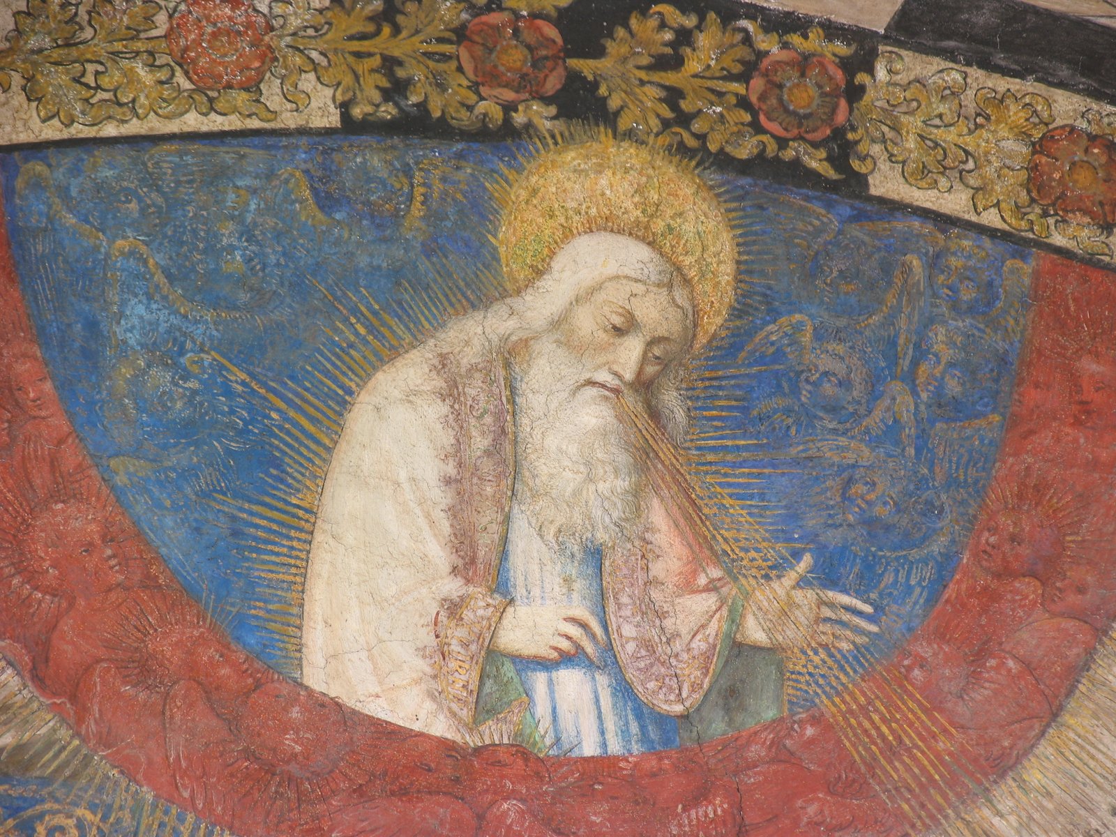
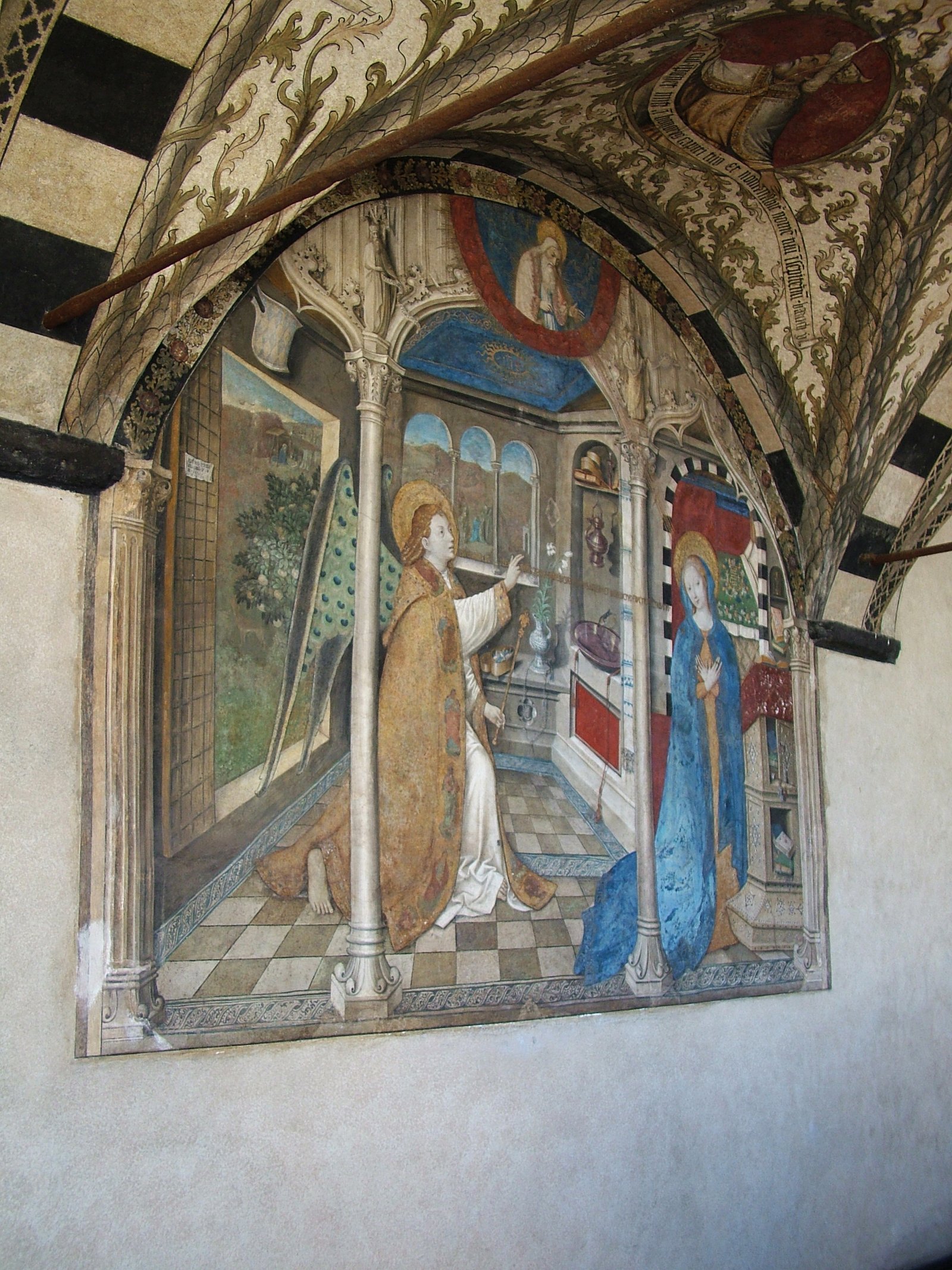
The flamboyant frame, finely crafted in trompe-l’oeil and adorned with pointed spires, small niches, statues, delicate tracings, leaves, and curls, is truly extraordinary in the Milan area and beyond. The architectural structure and decorative taste blend generic Flemish-Burgundian and German influences. The limited comparisons include the panels depicting the Stories of Saint Stephen, formerly attributed to Gualino, later attributed to Jean Bapteur by Romano, as well as and the Saint Jerome and his Disciples in the National Gallery of Dublin. These works share a similar layout, emphasizing the effect of a deep spatial box and a similar internal division. Frames constructed on a similar pattern also seem to have gained popularity in the Piedmont area towards the end of the 15th century. The polyptych of Novalesa, attributed to the workshop of Lonhy, and the Tana altarpiece of the Baptistery of Chieri (with extensive, partly ancient alterations) are prime examples of this trend. However, upon closer examination of the decoration, it becomes evident that the closest points of reference are the architectural elements depicted in the Christ before Pilate by Chiaravalle and in the Annunciation by Giusto di Ravensburg in Santa Maria di Castello in Genoa. The nimbi, typically Germanic in style, are found in a vast area spanning at least the upper and middle Rhine. These flat, intricately crafted nimbi feature flames or rays at their center, surrounded by two bands of intense brightness that enclose an elaborate Gothic script. Similar nimbi can also be found in Savoy: one example is the Adoration of the Magi in the Sabauda Gallery of Turin (no. 181), by an anonymous painter who was influenced by the Campinian style.

Beyond these and other details, which broadly suggest a chronological and geographical placement, it is worth highlighting the painting’s eccentric refinement, still appreciable despite the precarious state of the pictorial film. The artist has crafted an image of remarkable emotional restraint, striking a delicate balance between meticulous calligraphic focus and a surprisingly fluid approach. This image eschews the ostentatious display of wounds, blood, gestures, and grimaces, typical of many Germanic paintings, as well as various Jacquerian imitators [link to our writing about Giacomo Jaquerio, Nd]. In the figure of Christ, the rivulets of blood oozing from the wounds, still fluid and warm thanks to subtle touches of light, are of a poignant realism, yet never vulgar. It is no coincidence that they find precise echoes in the Trinity of Turin by Lonhy. However, the painter’s primary concern was not always material mimesis, as demonstrated by the relatively brief rendering of the rich fabrics and jewels on the borders. Quite another is his realistic tension when he sets about depicting the flesh tones, of an almost unabashed truth of light. Caressing the back and side walls, the same light lends credible depth to an environment built on a crooked perspective and denounces the meditated but autonomous assimilation of the Flemish lesson. A light coming from a relatively elevated position, on the left, that dances in clear brushstrokes on the nervous crests of the draperies, that marks the curtain rings one by one, that glides fluidly over the long metal poles of the pastorals, that lends the faces accentuated but soft transitions and that determines deep contours of shadow projected on the nimbuses.
In a tapestry of swift, summary brushstrokes, the same light manages to create a striking synthesis of Christ’s parched skin. His body, alive yet withered, barely covered by the loincloth, can no longer support itself on the cross’s shaft and is on the verge of collapsing to the ground. Despite its strong physicality, the body is surrounded by somewhat distant gazes, bearing witness to introspective meditations rather than physically participating in its suffering (here, too, the Flemish influence, particularly that of Rogier, is evident). The black and white photo only hints at the dizzying effect created by the fiery interplay of reds, from the brightest vermilion to brick-red and almost morello, in the Christ’s cloak, in St. Augustine’s robe and shoes, in the large curtain, in the vaults visible in the background and on the sides, and in at least three figures in the upper register. The connections between this panel and the Christ before Pilate in the oratory of San Bernardo in Chiaravalle appear to me to be very close, and I believe that both works are attributed to the same painter. Many comparisons can be made, starting with the face of Christ, which is almost a mirror image of the same model found in Chiaravalle. The morphology is identical, as seen in the soft hair and woolly beards, and the feeling is the same. Despite the differences in medium and technique, the brushstrokes are dense and fast, never disguised.
Saint Ambrose also offers a closely related interpretation of the face visible just above Christ in Chiaravalle, one that is only slightly less charged. The absorbed expression of the second saint from the left in the upper register is closely mirrored in the profile of Pilate’s servant. Some minor details are also strikingly similar, such as the faces of the angels, which have drier and more defined contours, as well as the nimbuses. The preference for flamboyant architecture and small sculptures painted within elaborate niches is identical, with additional similarities evident in the draperies, albeit poorly preserved in Chiaravalle. Certain colors, such as brick reds and light greens, also match the fresco. Both works—at least one of which can undoubtedly be attributed to execution in Italy—exhibit minimal engagement with contemporary Italian painting. Credo che le immagini siano sufficienti per giudicare se quanto propongo è fondato o meno.I believe the images suffice to determine whether my proposal is well-founded. Nonetheless, I would like to highlight a few additional elements. The exceptional mastery of drawing demonstrated by the author of the Chiaravalle fresco—particularly evident in the context of the unique technique employed (described during the restoration as resembling a watercolour fresco)—is the same skill that enables him to render the ornate, archigothic interlacing of the false frame on the panel entirely freehand. This is, moreover, a mastery that the artist consciously emphasizes for its autonomous expressive value. The relatively limited palette is also a common feature of the two paintings.In addition, the tone of the narrative, devoid of overtly grotesque elements, is notably coincidental. The sacred dramatic dignity characteristic of metropolitan Flanders is consistently maintained, though reinterpreted through a lens of curiosity that oscillates between aristocratic nostalgia and popular introversion. In many respects, it serves as a Germanic-language counterbalance to Lonhy’s humanistic approach.
The critical history of the Chiaravalle fresco presents various approaches to the attribution issue of these works. Following two interventions in the daily press by Forti Grazzini and Bertelli, which sought to distance the painting from the late 15th century and from the name of Bosch, Meijer drew attention to the Lower Rhine region, proposing a date around 1460. Castelfranchi then proposed a Savoyard perspective by interpreting the work in the context of late Jacquerian culture, Perronet Lamy’s miniatures, and Wittzian painting—although with some confusion between Konrad and Hans—suggesting a date in the fifth decade of the 15th century. Finally, Romano brought up the name of Hans Witz, referencing the reported presence of the Savoyard painter in Milan in 1478. Although distinct, the three hypotheses are not in direct opposition to one another. Romano’s proposal, the only one to connect even hypothetically with historical and documentary evidence, is based on the reconstruction of Hans Witz’s identity put forward by Sterling in 1986. This reconstruction centers around three works: the Pietà (without donor) in the Frick Collection, the Holy Family and Saints in the church of Capodimonte, and the Calvary with donor in Berlin—none of which can be dated much later than 1450. Among these paintings, the Chiaravalle fresco and, to a lesser extent, the Christ showing the wound in the side from Brugherio, various affinities can indeed be identified. Many of the bystanders in the Christ before Pilate exhibit facial features reminiscent of Witz, although the similarities are limited to the secondary characters.
The Neapolitan panel depicts figures in the foreground, standing before an interior constructed with confident ease, disregarding precise views and parallel straight lines. The scene is illuminated by pronounced lighting effects, reminiscent of those found in the panel previously held in Brugherio. In this work, we also observe a persistent anatomical realism, likely influenced by Campinia, not dissimilar to the one that permeates the Frick Pietà. Additionally, the contrast between the drapery that spreads out on the ground of the Saint Ambrose and the one that falls vertically on the Saint Augustine provides a softer interpretation of the same effect in the Calvary of Berlin. The distinct, almost coarse outline that separates the forehead from the mitre of St. Ambrose himself appears in the Santa Caterina of Capodimonte, whose hair is rendered by a sort of grid not dissimilar to those of the two bishop’s mitres in the panel already in Brugherio. The same energetic statuettes, quickly sketched yet highly expressive, can be found in Naples, Chiaravalle, and in this panel. Despite Sterling’s reconstruction being hypothetical, the historical element remains a significant factor in this hypothesis.
Beyond the evidence of a composite Rhine-Alpine culture, which still supports the Witz hypothesis, it is worth considering whether the twenty-to-twenty-five years that separate the panels attributed to him from his stay in Milan are sufficient to explain the differences. In other words, can the evolution outlined by Sterling for a Hans who breaks free from strict Konradian observance lead to the wall of Chiaravalle and the altar of Brugherio? The differences are significant: the two Milanese works lack the sharpness of noses and cheekbones, the barely sketched hands, the strong and flattened folds of the draperies; there is also very little of the sculptural style, the Eyckian spatiality (albeit distorted compared to Konrad’s interpretation) within which the abundant garments carve out a place for themselves, swelling emphatically. Could it be the same hand, two decades apart? The reduction in imitative elements, which had been a significant factor in attributing the three panels to Konrad himself (as repeatedly proposed by scholars), seems to me to suggest a negative answer. The evolution of the Witzian current is further evidenced in 1458 by the rough and pungent Tomb of Vhilibert de Monthouz in Saint-Maurice, Annecy, following a path that, with some effort, could lead to Chiaravalle and Brugherio twenty years later. Furthermore, it’s worth noting that the historical identity of the Witz who resided in Milan in 1478 remains unclear. In fact, it’s highly probable that at least two painters with this name existed during that time. To reinforce this impression – and to steer the discussion towards a less uncertain terrain than the documentary one – I reintroduce the Genoese fresco of Santa Maria di Castello, where, as early as 1451, Giusto di Ravensburg reveals a close kinship with the painter of Brugherio and Chiaravalle in certain passages.I’ve already touched on the architectural framework, but it’s worth emphasizing that the decorative taste and details – capitals, statuettes, pinnacles, curling foliage – are absolutely identical. Additionally, in Chiaravalle, as in a secondary area in the Genoese convent, there’s a curious crenellated pattern above round oculi, previously noted by Castelfranchi.
The similarities don’t end there: you can compare the two stern and introverted figures of God the Father, surrounded by cherubs in Genoa and Brugherio, or notice the similarities between the meticulously depicted St. Ambrose and the Angel of the Annunciation, with their faces marked by an aristocratic yet somewhat vacant expression. Common accents can be found in some sections of the draperies, soft yet energetic and crested with light, which bear little resemblance to Flemish in the strict sense. The prehensile hands, posed with a touch of affectation, also appear similar. The elaborate framing, which creates an abstract effect, separates the space of the pictorial representation from the real one, and is conceptually analogous. No scholar has yet taken Chiaravalle’s work into serious consideration, as a term of comparison, the Genoese fresco with its certain author (with the sole exception of Castelfranchi, who limits herself to observing the identity of decorative taste); a connection with Giusto, however, is undoubtedly present and appears to be strengthened by the Brugherio panel. The differences are also worth noting, starting with the color register, which is more subdued in Genoa and has a more international Gothic taste.
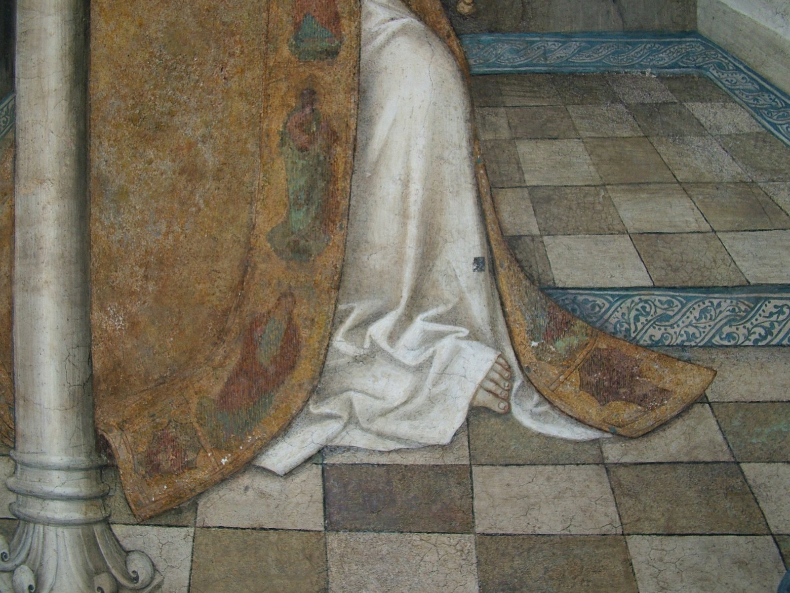
In the cloister of Santa Maria di Castello, the eccentric naturalism and the anatomical realism, at times obsessive, are more subdued. The fluidity of the hand and the expressive power of the design, as seen in Chiaravalle, are not as noticeable. The entire Genoese fresco appears to me as a more carefully crafted, serene work, the result of a mature late-Gothic tradition that yields, with complacency but without upheaval, to the more fashionable influences of the ars nova from the metropolitan Flanders. Giusto’s explicit Eyckian-Provençal tributes do not seem to find unequivocal confirmation in the two Milanese works, whose author updates his late-Gothic and international matrix with the almost expressionist use of a strong vein of South German realism. I realize I could be mistaken, and the hand may indeed be the same. To explain the differences that prevented me from making the attributive leap – a significant temptation – it would be necessary to first assume a significant chronological gap (perhaps ten or fifteen years?). The ground is slippery: the last news we have today about Giusto di Ravensburg dates back to 1452, when the painter was documented in his hometown to handle family matters. Secondly, it’s essential to consider a significant evolution in his style. While not insurmountable, these obstacles do exist. In essence, the issue lies in the fact that the Chiaravalle fresco remains too isolated and fails to provide a clear indication of its execution date. This is further supported by the diverse range of hypotheses proposed by scholars thus far, spanning from 1440 to approximately 1506. The panel, previously in Brugherio, offers new arguments for a date not too close to the end of the fifteenth century, but it doesn’t solve all the problems. On the other hand, even a master like Charles Sterling had moved the Trinity of Turin thirty years forward from the most reliable current hypotheses, and this speaks volumes about the uncertainties of the poorly developed territories. Going further in imagining how Giusto di Ravensburg could paint at a time when we don’t even know if he was alive, or reconstructing the style of around 1478 of the elusive Hans Witz, a sort of Zanetto Bugatto in reverse, both seem a bit rash to me. Not sterile, though. I choose to withhold definitive judgment regarding these works, which date from the third quarter of the 15th century and are attributed to the so-called ‘German Master of Clairvaux.’ This painter, likely from the region of Constance and potentially a pupil of Justus of Ravensburg, demonstrates sensitivity to Wittzian influences and appears to have been active in the Savoy states after the mid-15th century. While this analysis raises more questions than it answers, I argue that this approach carries both methodological validity and interpretive significance. The author of the fresco and panel painting, already present in Brugherio, undoubtedly deserves a place in the artistic developments of the second half of the 15th century: in the context of Italian art, he may have played a significant role in shuffling the cards around the widely accepted thesis that Genoa and Liguria were the sole sources of northern European artistic influence on Milanese painters after the mid-century.
*The original title of the essay is: “Una nuova presenza oltremontana nella pittura milanese di età sforzesca”.
December 2, 2024